# dr00 Trends
- What: This is a live interactive dashboard I built to surface personal insights about my health, sleep, mental acuity and behaviour. It is a work in progress.
- When: 2021 - Present
# About
# Data
I am currently collecting data from three sources:
- Oura Ring (opens new window): This is a ring I wear that contains an accelerometer and sensors for measuring heart rate, respiration and body temperature. It provides live data on my sleep, activity levels and readiness.
- Bearable (opens new window): This is an app I use to track my mood, health symptoms, substance intake (e.g. coffee, alcohol etc.) and other factors (e.g. screen time, places, social activity etc.)
- Human Benchmark (opens new window): This is a series of online tests that measure visual and numerical memory, reaction time, hand-eye coordination, verbal skills and more.
More data sources will be added in future.
# Technology
Most of this project was built using Python. For the data ingestion and processing pipeline I am using the Kedro (opens new window) framework. The front-end is a Streamlit (opens new window) dashboard with Plotly (opens new window) used for data visualisation.
# Dashboard
# Overview
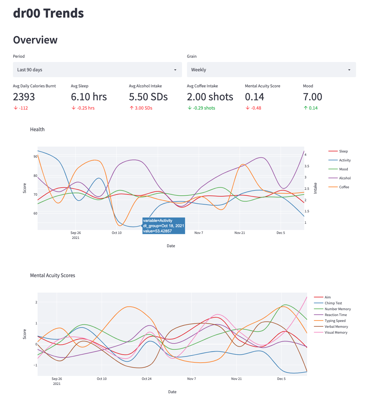
This is the front page of my app. It provides headline metrics and deltas as well as trends over time. All of the plots are interactive and variables can be turned on and off.
You can also adjust the period ("Last 7 days", "Last 30 days", "Last 90 days" or "All time") and granularity ("Daily", "Weekly" or "Monthly").
# Correlation Analysis
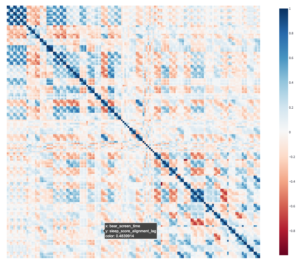
This section is used for exploring relationships between variables. My three data sources provide lots of raw data but I also transform this data to generate lagged variables, moving averages, aggregates etc. This results in over 200 data points per day.
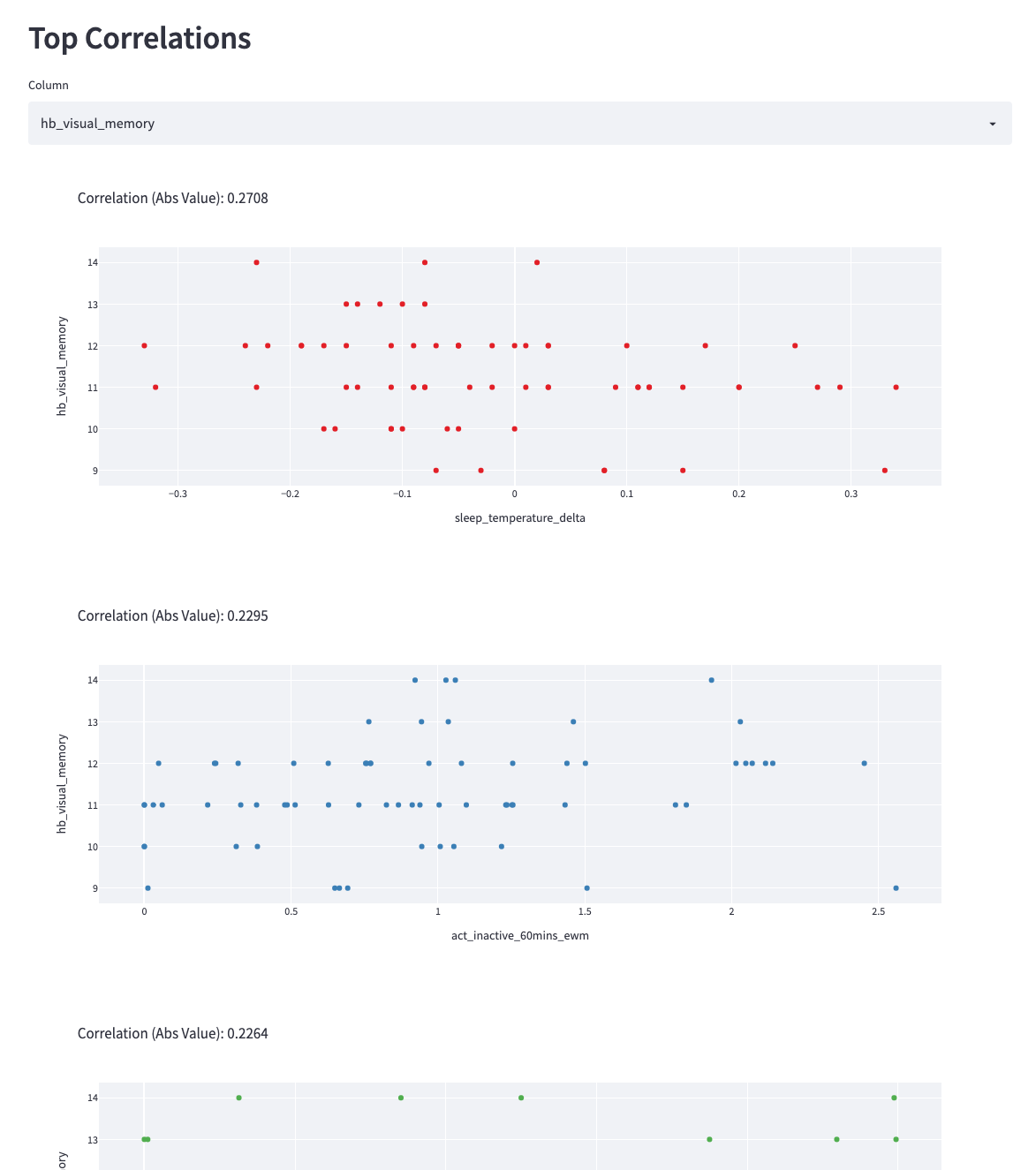
In this module I can select a variable of interest (e.g. here I have selected my performance on a visual memory test) and the dashboard will display a scatter plot for the top 5 most correlated variables.
The above section is useful for investigating the causes and impacts of specific variables but I have also created the below correlation heatmap which allows a user to visually identify strong relationships between pairs of metrics.